IEEE COLLABRATEC
Enhancing Engineering Connections Through User Experience
The
Challenge
Our
Approach
The
Result

Collabratec is an online collaboration platform created by the Institute of Electrical and Electronics Engineers (IEEE). As the site grew—both in its number of active users and platform capabilities—it became increasingly important to maintain and improve key aspects of the site’s interface and user experience (UX). The D2 Creative team has worked extensively with IEEE in a variety of branding and design projects for Collabratec in recent years, so when UI/UX work is needed, they turn to us.
Below are some of the improvements we’ve helped implement.
Highlighting What’s Important with UI
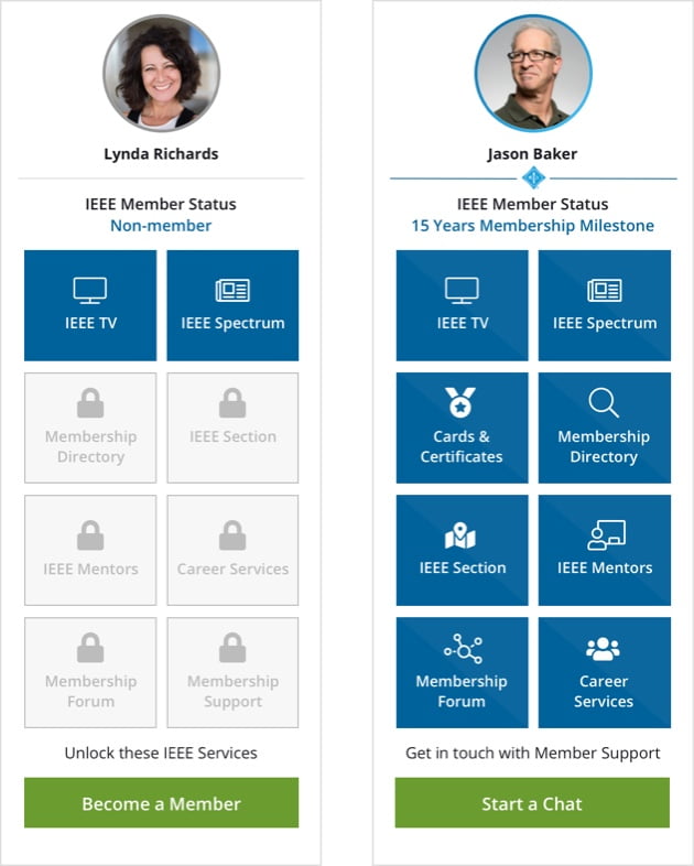
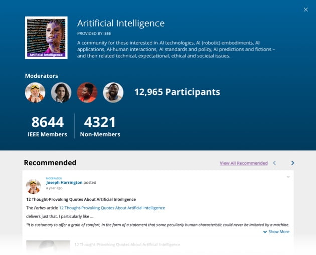
Collabratec features online communities where like-minded users can connect with one another as well as workspaces to foster collaboration on papers and research. It is the mission of IEEE Collabratec to bring together professionals of similar disciplines, so we believed that connection and collaboration should be at the forefront of the site design as well. That’s why we made updates to how related content was grouped on the site, cleaning up the site’s navigation and making it easier for users to find exactly what they’re looking for. Furthermore, we helped them redesign their user dashboard to promote communities and workspaces of interest to users.
Truly Personalized Email Digest
Users were sent regular emails to keep them up to date on site happenings, but the content was not tailored to the interests of the recipient, which was resulting in less engagement. Using the original digest as the template, we made several updates to make these emails focused on the user’s interests. We updated the messaging to make the emails feel less automated and more personal. And, to take things even further, we changed how the emails pull content so that they only pulled from the communities and workspaces the recipient was a part of, to ensure each user’s trending topics were contextual and relevant.
A Homepage That Drives Conversions
Our team wanted to ensure that Collabratec’s growth continued and stayed sustainable, and the best way to do so to update the homepage and make it easier for visitors to learn about the benefits of the platform and how to sign up. We generated heat maps of their current site to determine what content users were drawn to and what either wasn’t enticing them or was hard to find. With this insight, we were able to prioritize the most important content in our updated messaging. We also used this knowledge to design a more seamless site design—guiding users more effectively so that they will register for the platform.
Our work for Collabratec is ongoing, but the impact of what has already been done is undeniable as Collabratec’s user base continues to expand year after year. But, it’s not just their number of users that’s growing. Since we’ve begun these UI and UX changes, we’ve seen increasing in platform satisfaction year over year. Our efforts also help drive IEEE’s recruitment through Collabratec by keeping users engaged long enough to become prospective members. We’re excited to see what future updates and enhancements we can help create for the platform as we continue to be a part of its success.
IMPROVED USER EXPERIENCE
Email Campaign

WEB DESIGN & DEVELOPMENT


