Coriell Life Sciences
Crafting a New Identity for an Industry Pioneer
The
Challenge
Our
Approach
The
Result

Coriell Life Sciences (CLS), a commercial entity spun off from genomics industry pioneer the Coriell Institute, was in “pivot mode”. Moving from solely relying on laboratories as customers, CLS set their focus on enterprise pharmacogenetic testing (PGx) for identifying genetic risks in patient care including drug-gene interactions and incorporating other big data such as drug-drug interactions and lifestyle risks to help develop better treatment options. In this context, the company needed to speak to a broader range of players—including members of the public who are part of populations being targeted for this genetic testing.
CLS’ marketing materials and web presence did not speak to this new mission and the company needed to be repositioned to compete in the ever-crowding genomic testing marketplace.
We guided Coriell Life Sciences through our brand discovery process to understand key drivers of the organization, its service offerings, how they address marketplace needs. Our life science marketing experience and findings from Coriell let us craft a messaging framework that clearly articulated the value proposition in a way that resonated with the multitude of audiences including providers, medical professionals and member patients. The discovery process also fueled the visualization of the new brand identity.
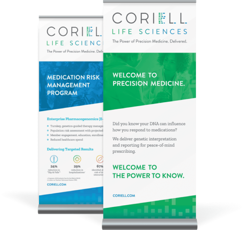
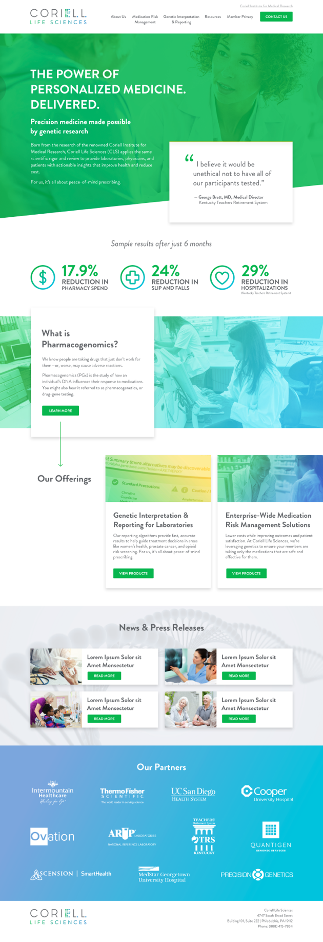
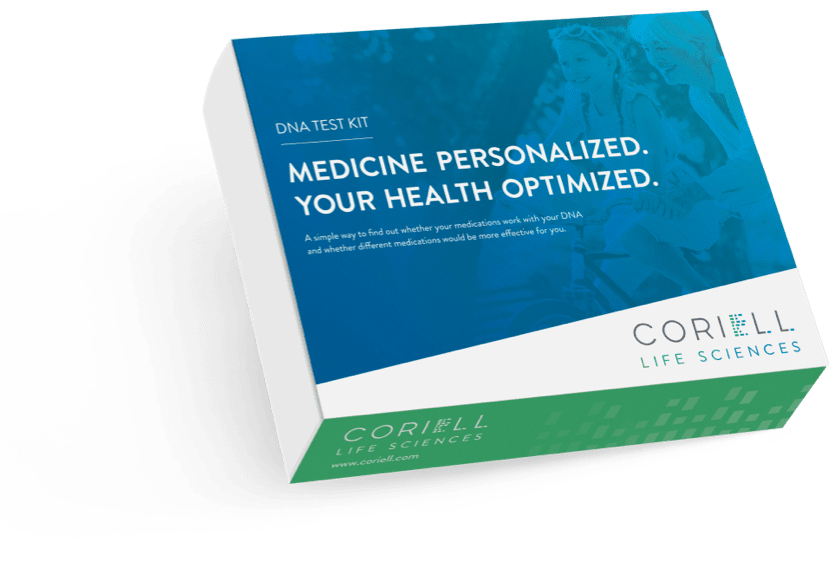
D2 delivered a stand out brand identity and message platform for a stand out company in the pharmacogenomic testing space. We’ve translated that to tactical deliverables including a brand style guide to ensure continuity, an icon library to simplify storytelling, a new website, product packaging, and trade show display materials. Now armed with the right communication tools, Coriell Life Sciences is able advance their position as a trusted provider of genetic laboratory interpretation and reporting services.
Branding

The Coriell Life Sciences logo is the cornerstone of our visual identity. It’s a guarantee of quality and our promise to deliver on the knowledge and insights we are able to derive utilizing precision medicine. Our logo is a unique piece of artwork. The proportion and arrangement of the wordmark have been specifically determined and the “E” contains a coded word. The logo should never be typeset, recreated or altered, which could cause inconsistencies that dilute the impact of the brand’s power. To preserve its integrity, always maintain a minimum clear space around the logo. This clear space isolates the logo from competing graphic elements such as other logos, copy, photography or background patterns that may divert attention. The minimum clear space for the Coriell logo is defined as the height of the “O” in the wordmark. This minimum space should be maintained as the logo is proportionally enlarged or reduced in size.
Visual Identity

Typography

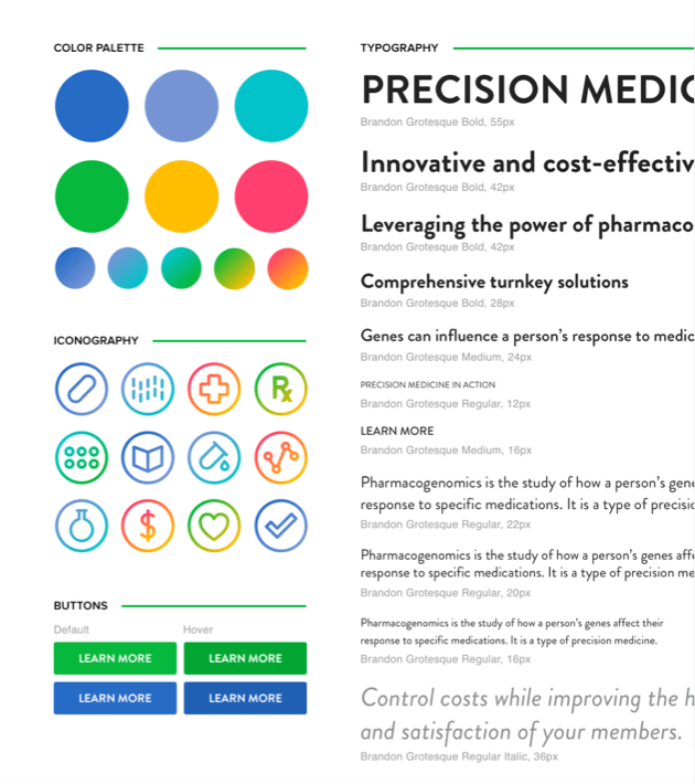
To help provide a consistent, unified look in the Coriell brand’s use of typography, the Brandon Grotesque and Zilla Slab typefaces should be used on all communications.
The thick and thin quality of Brandon Grotesque’s sans serif characters is simple yet distinctive and supports the competent and innovative personality of the Coriell brand. It is recommended that headlines be set in Brandon Grotesque all caps. Zilla Slab is a contemporary slab serif, constructed with smooth curves and true italics, which gives text an unexpectedly sophisticated industrial look and a friendly approachability in all weights. It helps support the sincere facets of Coriell Life Sciences’ personality. Zilla Slab is recommended for body copy in digital and print applications where appropriate.
Photography

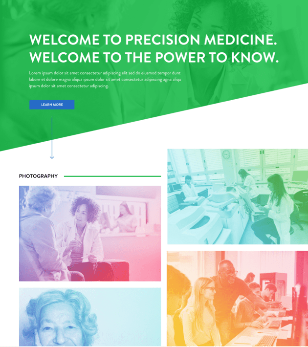
Photographic imagery is a critical component to further establish the Coriell brand identity. Consistency in photographic style and subject matter is necessary to convey our brand promise: The Power of Precision Medicine. Delivered.
Imagery selections should work to tell this story in a powerful and positive way. Groups of people should be engaged, portraits of everyday people emote well-being while medical professionals emote confidence. A gradient overlay from the approved brand palette is applied to photography to provide flexibility and strengthen the visual connection with Coriell Life Sciences.
Mood Board
Website Design & Development
Iconography
Packaging Design
Trade Show Display
