COOPERSURGICAL MEDICAL DEVICES
Boost Sales with a Simplified User Experience
The
Challenge
Our
Approach
The
Result

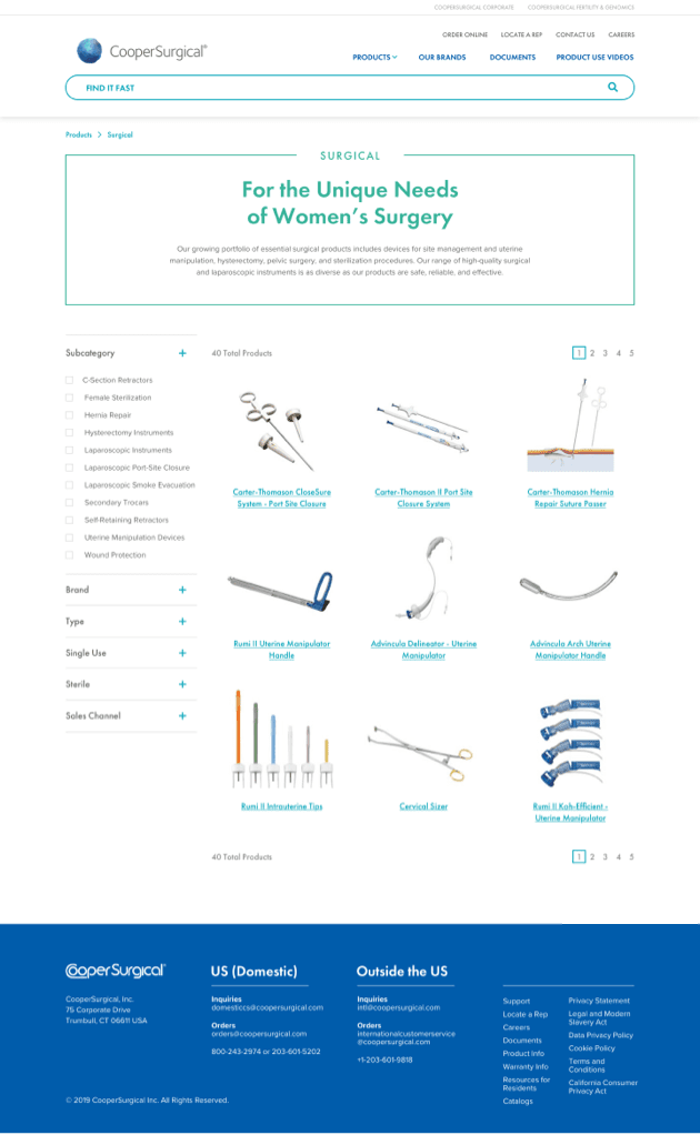
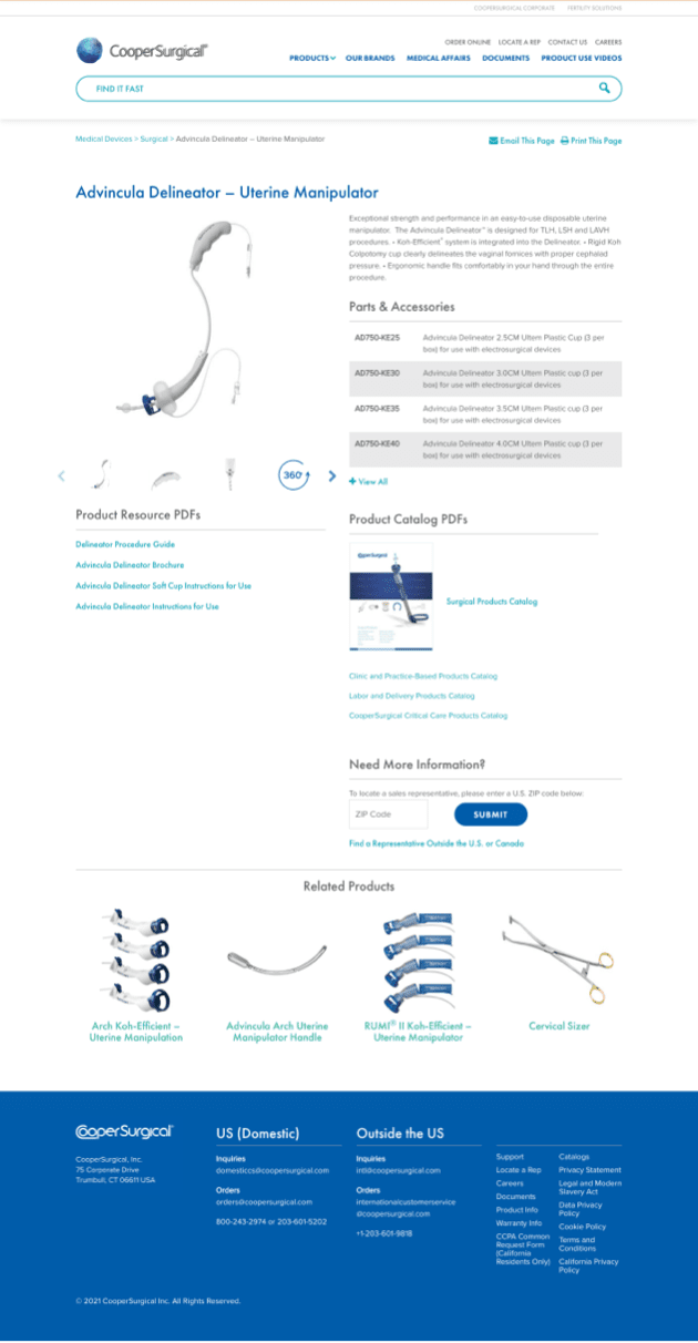
When site visits and sales are closely connected, it’s important to create a user experience with clear and accessible navigation and design, regardless of the device. D2 Creative was charged with the task of simplifying our client’s catalog site – with over 2,000 products – and reimagining their education and customer service areas.
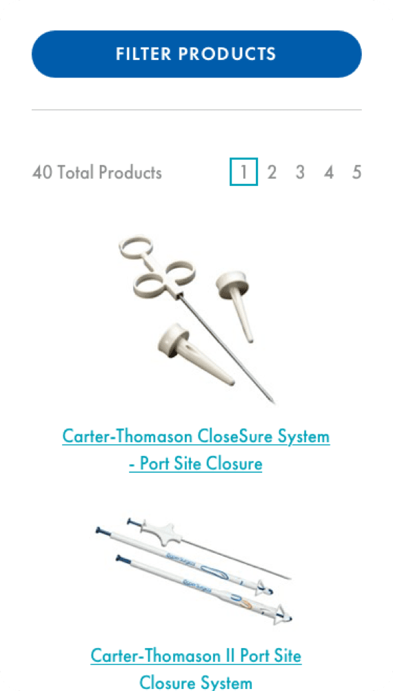
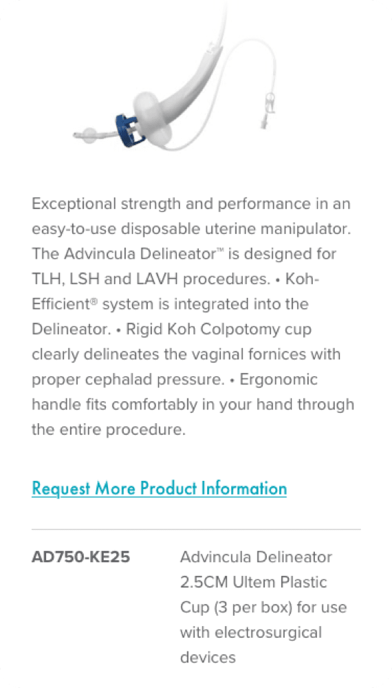
To create this catalog site, we developed a more logical site structure with simplified navigation that requires fewer clicks to locate products. In doing so, we were also able to create an education center and video library for customers seeking more information about CooperSurgical’s products.
And while much of the focus is on the consumer’s experience, we also needed to ensure the website was simple to update. We built the product section on an eCommerce platform, streamlining the experience with intuitive navigation, allowing the client to maintain their product catalog.
With an intuitive and efficient redesign, we created a website that provides a welcoming user experience to consumers while positioning the client as a leader in their field. As a direct result:
- There are fewer online service inquiries, as customers get more of the information they need through the site.
- Traffic to the educational components of the site has doubled.
- There’s been a 15% reduction in the number of pages viewed per visit, as users find their way to the page they need more quickly.


