QOLOGY
Website Design to Drive Engagement and Subscriptions
The
Challenge
Our
Approach
The
Result

Our client had an existing, peer-to-peer professional networking website. They asked us to explore ways to increase subscription rates and generate more user activity.
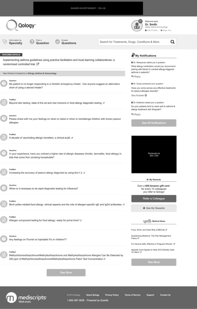
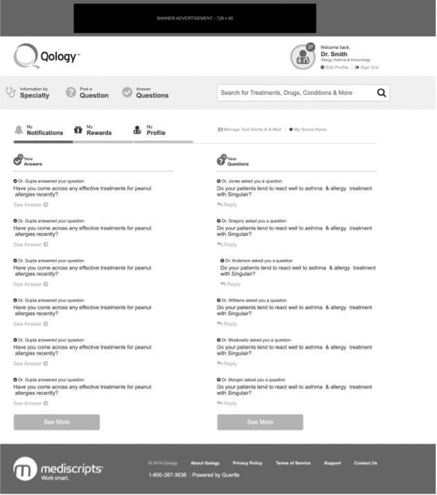
Our design and UI/UX teams performed an analysis of the design elements and quickly determined there were a number of opportunities for improvement. We found the user interface was cluttered. Numerous elements made it confusing and difficult for visitors to understand how to use the site.
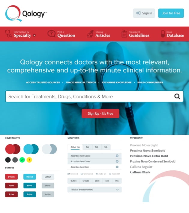
Secondly, the imagery and color palette didn’t convey to users the professional attitude the brand wanted to project. Finally, we felt it was very important to develop a more compelling value proposition to further reinforce a positive user experience.
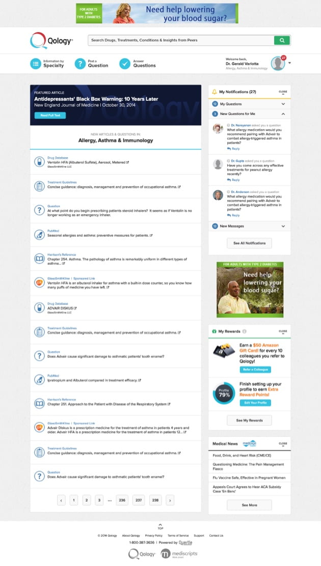
Starting with these changes, we set out to create a site with a modern look that would be easy for users to navigate, regardless of device or platform.
During our initial analysis, we also collected valuable data on mobile-user behavior and how the site search tool was being used.
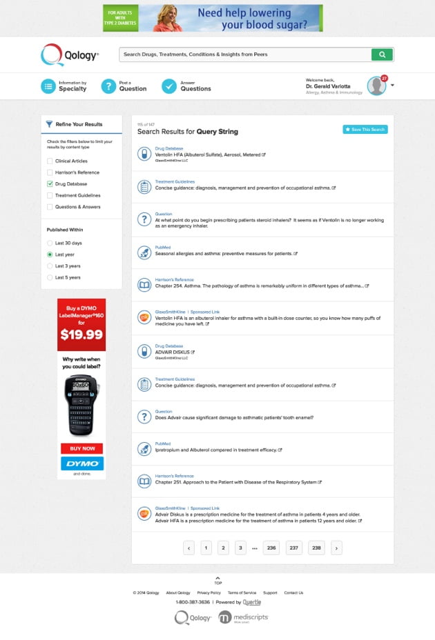
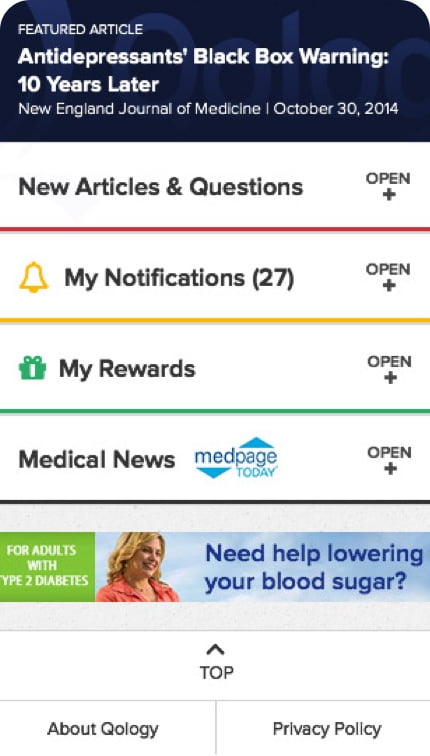
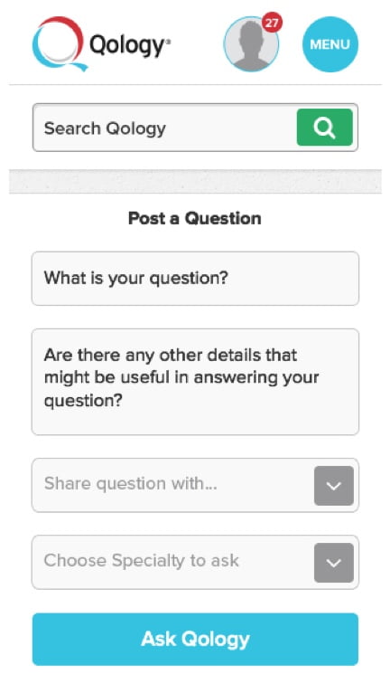
The new website design is responsive and easier to use. When we developed the new UI, we made sure to place site search front and center and to streamline the experience for mobile users. All of these changes resulted in a site that encouraged greater interaction, ultimately leading to an increase in usage and subscriptions.
MOOD BOARD
